Mooshka — Floral Branding Inspired by Nature and Art Nouveau
Mooshka is a floral decoration studio created by Małgorzata Muszyńska (spelled mooshynska), blending natural elegance with an artistic, handcrafted approach to floristry.
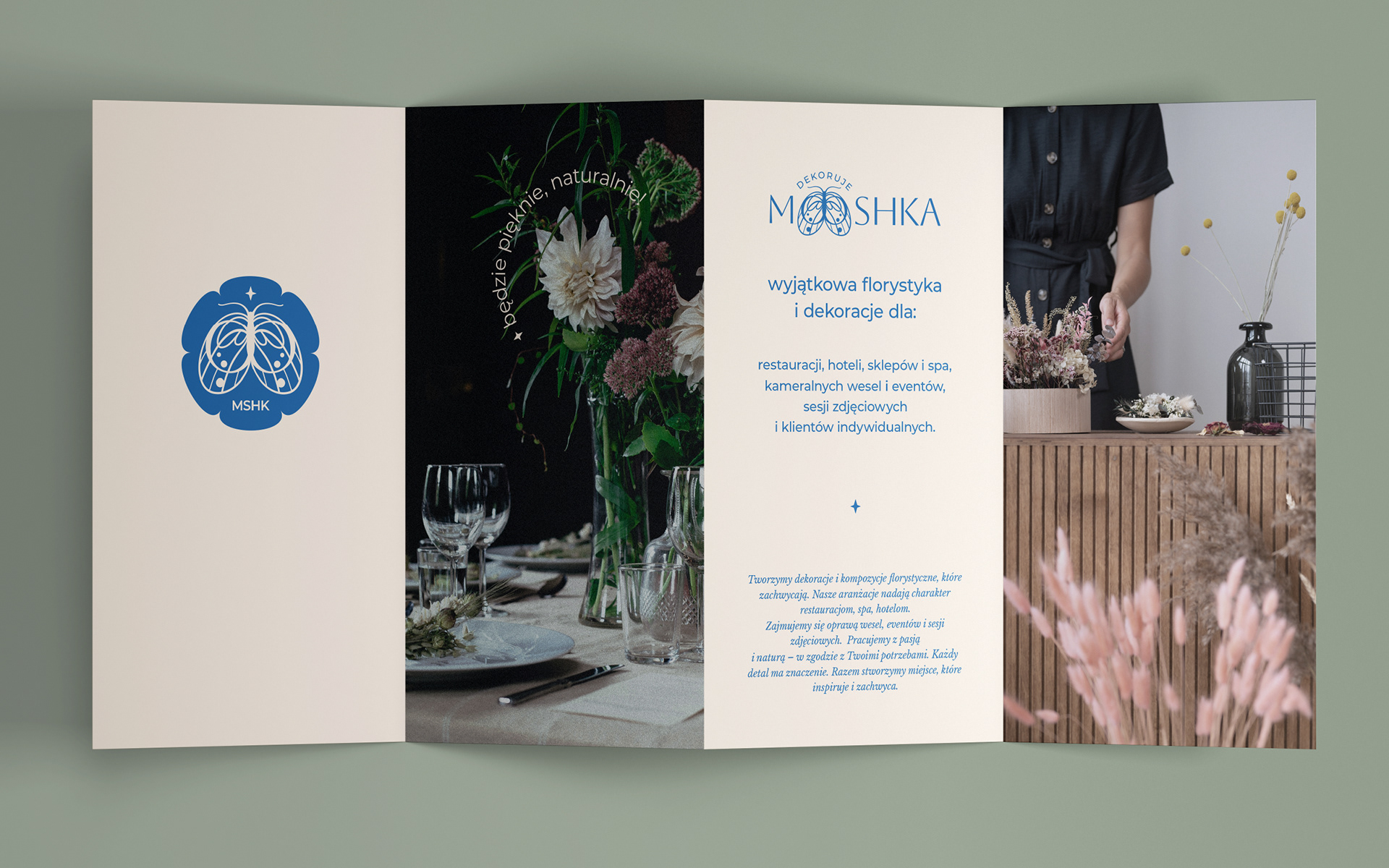
The goal of the branding was to create an identity that felt delicate, and elegant while standing apart from typical rustic flower shop aesthetics.
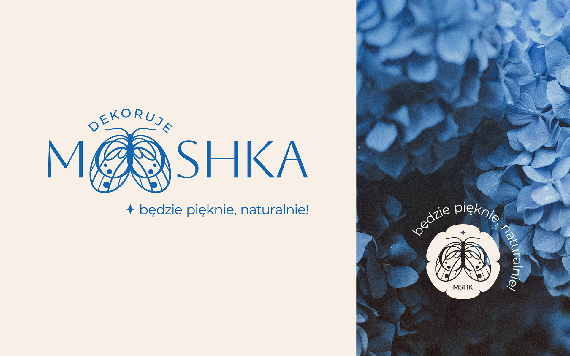
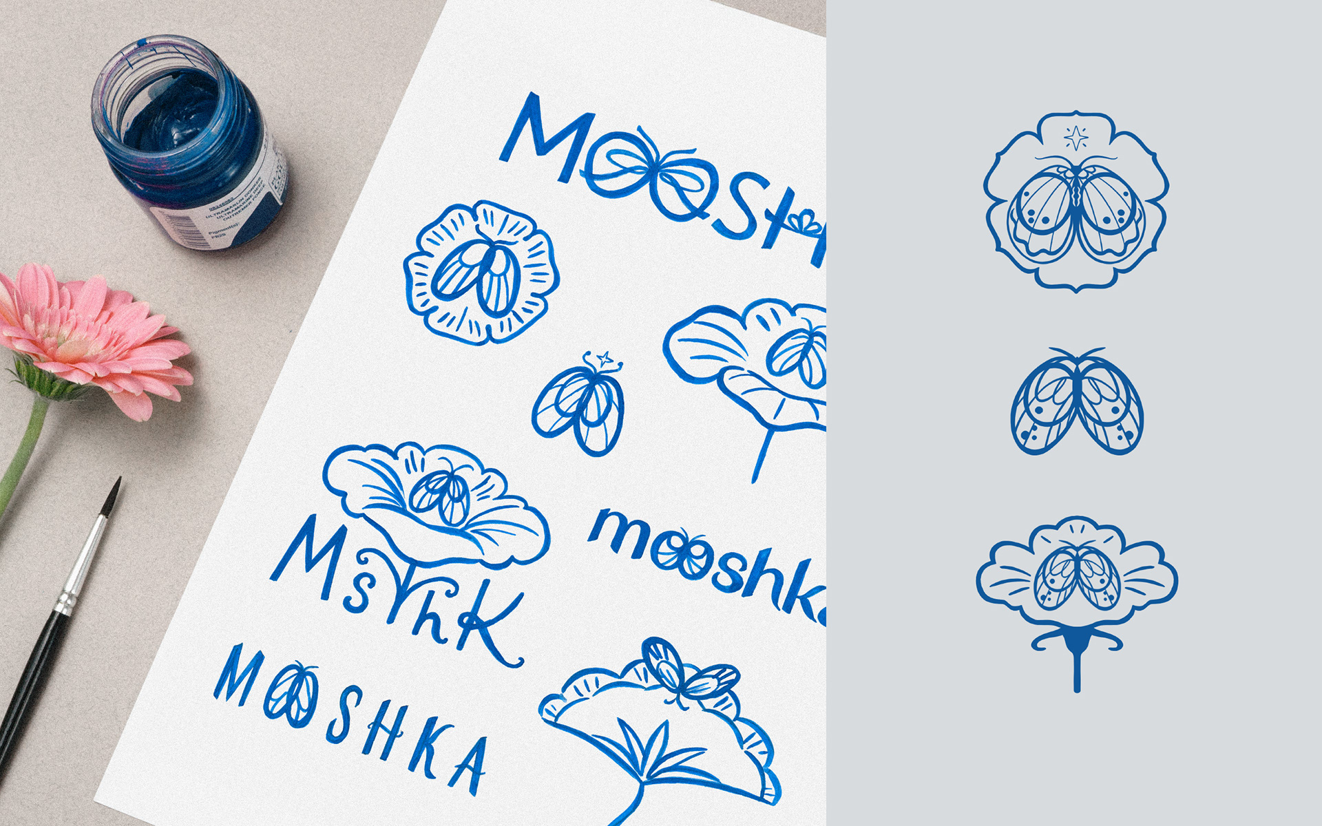
The name Mooshka (muszka in Polish) can suggest both a bow tie and a tiny fly — something small, delicate, decorative, yet deeply connected to nature. This dual meaning perfectly captured the essence of Małgorzata’s work.
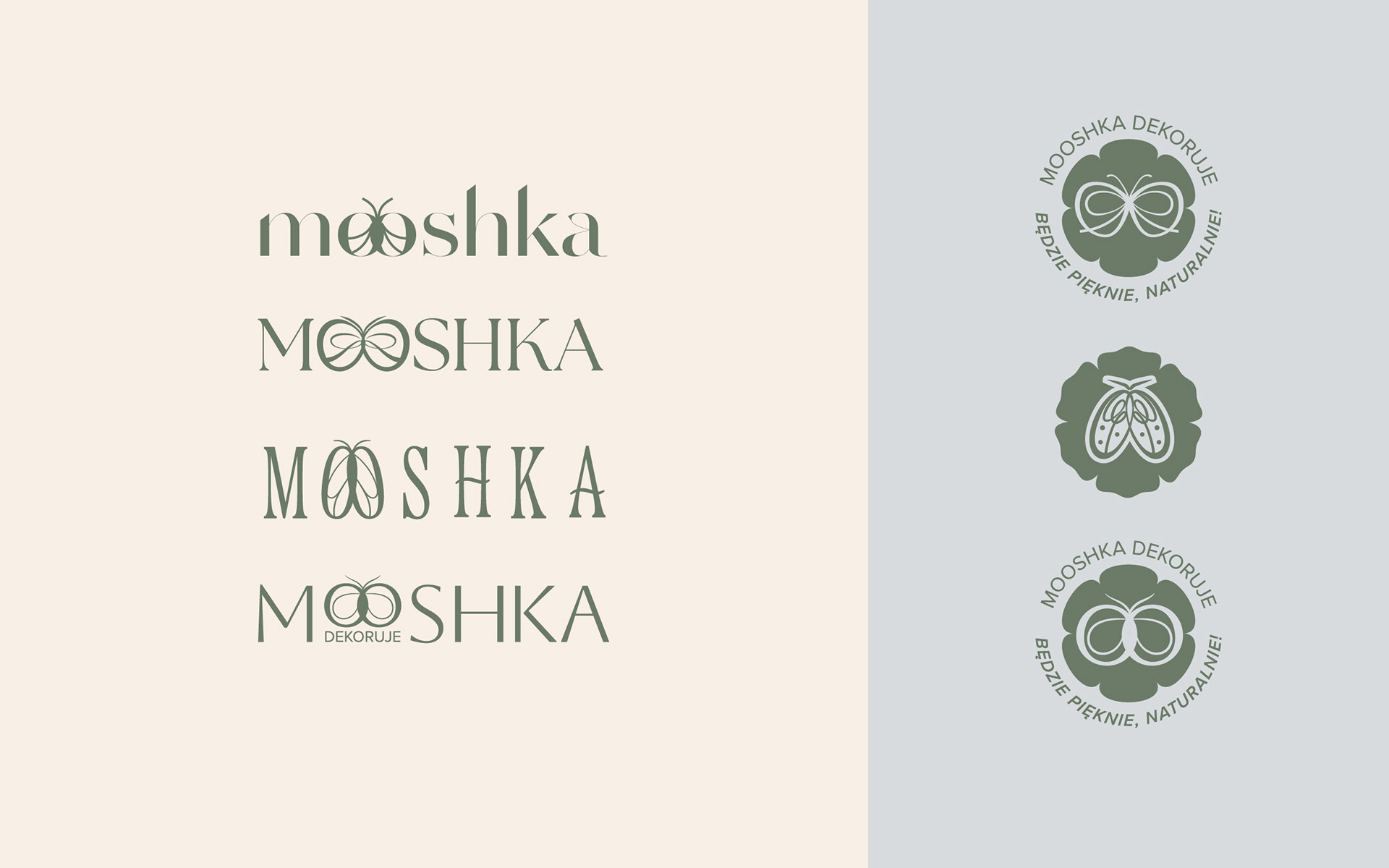
I focused on the two “O”s in the word Mooshka, transforming them into delicate insect wings and placing a stylised little fly between the clean geometric letters of the logo, as if it had gently landed there.
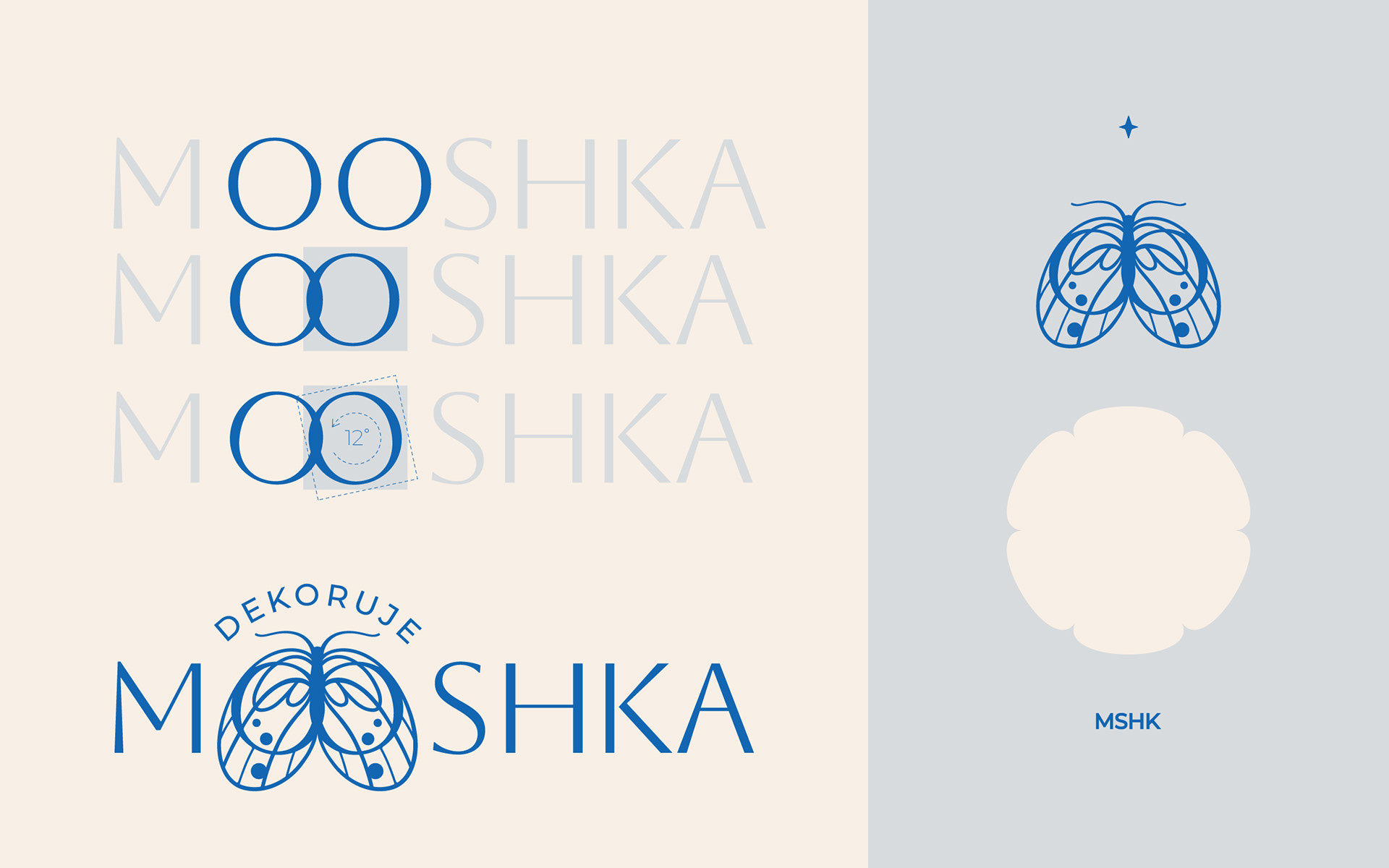
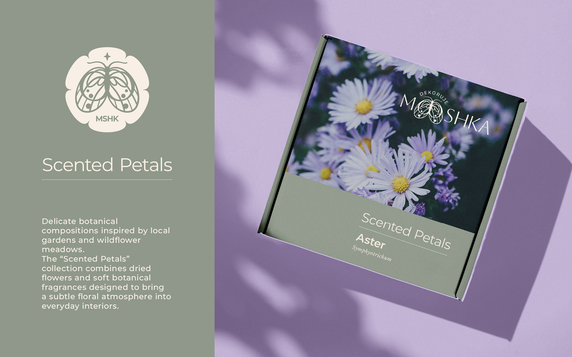
Inspired by Art Nouveau ornamentation, wild meadow insects, and floral emblems, I also created a secondary flower-shaped sygnet featuring the shortened name MSHK, accompanied by a small star symbolising creativity, elegance, and the joy decoration can bring.
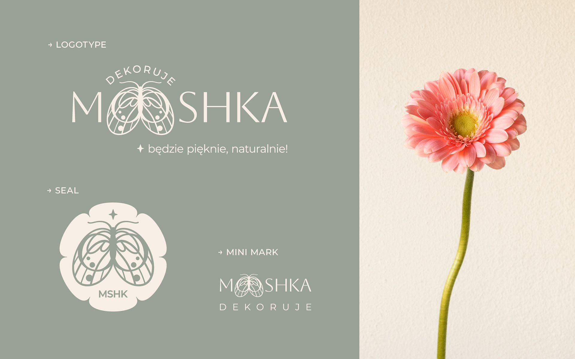
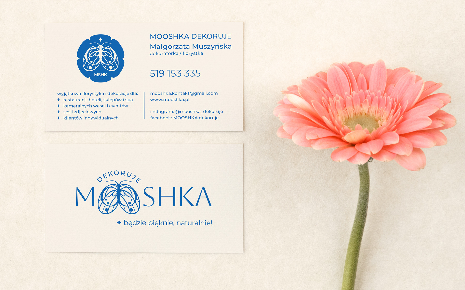
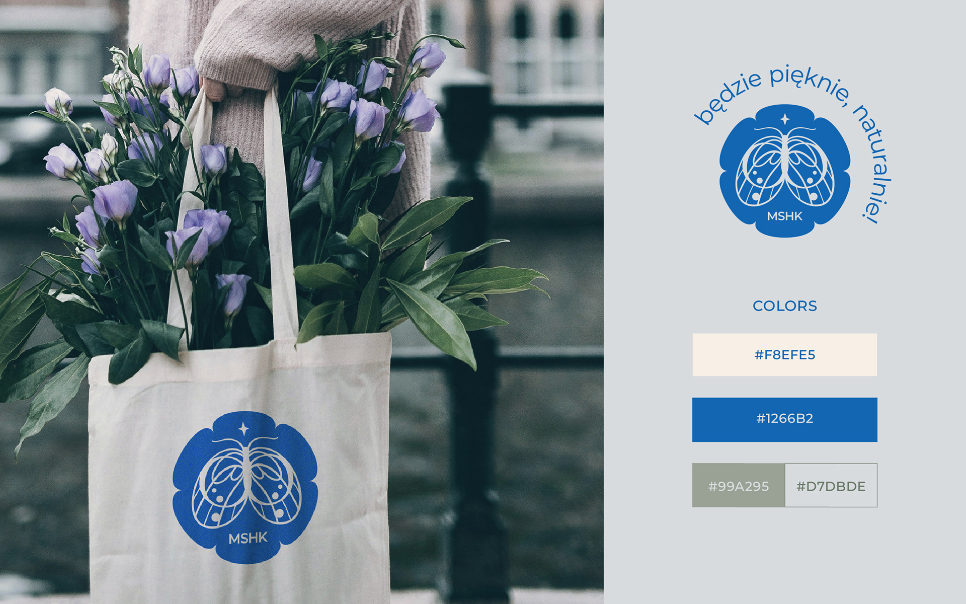
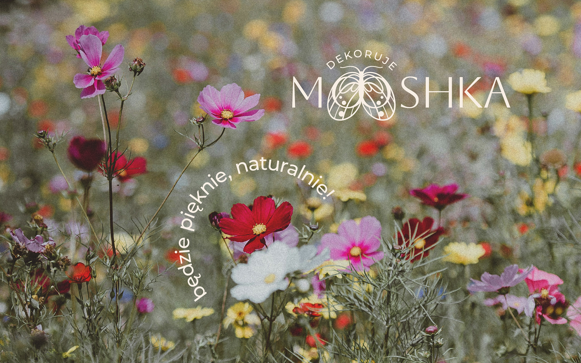
The identity is accompanied by the slogan “It’s going to be beautiful, naturally,” arranged along a circular path that echoes the shape of flower petals and traditional decorative seals.
A palette of soft cream, vivid floral blue, and muted greens was designed to work harmoniously with photography of floral arrangements across social media, and print.
A palette of soft cream, vivid floral blue, and muted greens was designed to work harmoniously with photography of floral arrangements across social media, and print.
Mooshka is currently a floral decoration studio and doesn’t offer physical products — but if it ever did, I imagine it would be a collection of “Scented Petals”: floral objects inspired by treasures gathered in gardens, forests, and wild meadows, accompanied by natural botanical scents.
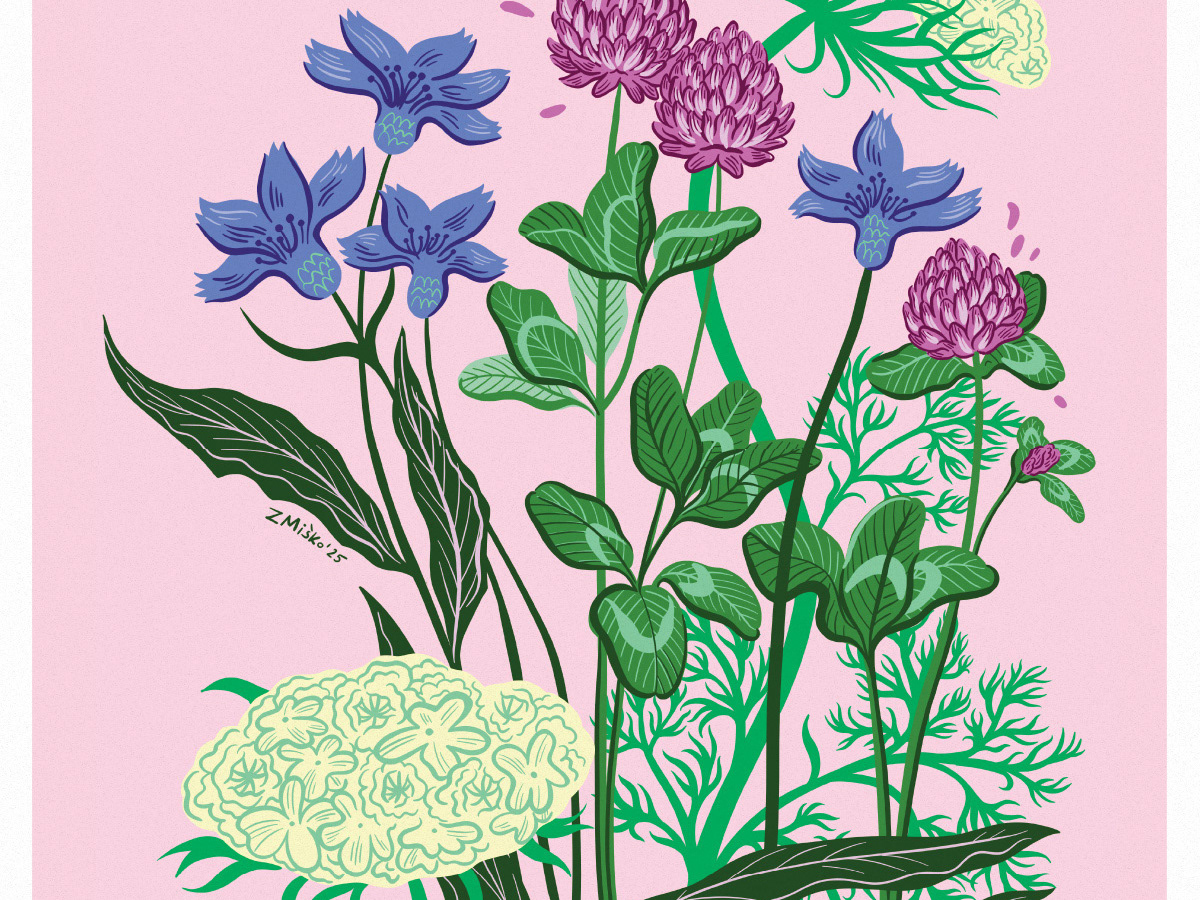
The identity began with hand drawings and gouache sketches before being refined and fully executed in Adobe Illustrator.
Gerbera photos by Zuza Miśko. Other portfolio photos sourced from Unsplash artists: Annie Spratt, Florencia Viadana and from Freepic.